And then they went and changed their UIX or User Interface Experience. I haven't been back since.
Here is a screen shot of their new UIX:
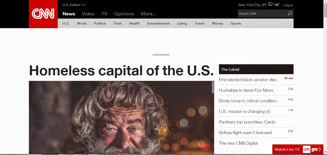
One sits there and waits for the top news stories to scroll through and automatically change. The screen grab that I took featured prominently was a city that was the homeless capital of the US. You cannot see at a glance, what is happening in the world.
Contrast this to a Reuters screen capture of exactly the same time. We have victim #22's body of the Air Asia disaster being brought to shore. We have a story on Iran and shipping enriched uranium to Russia. And we have the death report of Edward Brooks, the first black US senator elected by popular vote, and I can see the story about an Idaho earthquake. I can read all of this stuff from a tiny screen capture.

The CNN screen capture has a faint column that is unreadable in the screen capture. If you enlarge it, it has a few terse ambiguous headlines about the death of Brooks, without giving his name, The second entry is Mike Huckabee leaving Faux News. We also have the story of Panthers Top Punchless Cards and they trumpet themselves in the NEW CNN DIGITAL.
It appears that CNN let their web developers go wild, thinking that it looks neat, but not having a clue on how to present news. The continuous flashing/changing stories makes me sit and wait to see if there is anything interesting to grab my attention. And when trivial crap comes up, it makes the wait more useless. Their UIX hearkens back to the days when HTML had the stupid flashing banner, and the revolving storybook would look good in on an online snowboard catalog, but not for a new site that wants to be taken seriously.
I'm not really sure that news is their focus -- they seem to want to invent something called newstainment - which is a meld of entertainment and news. If they want to be a serious news provider, they should emulate the UIX of bbc.com or reuters.com. I know that these sites are serious about the news, because I belong to user panels on both of those sites, and give feedback on past and upcoming stories.
They say that every dog has their day, and the CNN site has turned into one, but it's day is gone. #FAIL
No comments:
Post a Comment